Neurodevelopment

Analyzing the effect of Condition (Hypoxia vs Normoxia) on a neurodevelopment gene panel
Setup
source(here::here("src", "setup.R"), echo = FALSE)

## Since downlit doesn't seem to link packages without an explicit & visible library() call anymore ...

library(here)
library(pipebind)

library(dplyr)
library(tidyr)
library(stringr)
library(purrr)
library(ggplot2)

library(glmmTMB)
library(parameters)
library(insight)
library(performance)
library(emmeans)

library(DT)
library(plotly)

## Data

supplementary_data <- load_supplementary_data()

ND_data <- load_pcr_data("ND")

1 Clean data

Here’s the data from our neurodevelopment gene panel, which has been cleaned by:

  • Removing missing DCq values
  • Removing genes missing either N or IH Condition
  • Removing genes having less than 3 data points in either the N or IH Condition

2 Model fitting & diagnostics

2.1 Fitting the model

Let’s define the model we will fit to each Gene’s DCq data.

Here, we will fit a simple Linear Model, which is largely similar to running a t-test between both conditions:

\[ \begin{aligned} DCq &\sim N \left(\alpha + \beta_{1}(Condition), \sigma^2 \right) \end{aligned} \]

ND_model <- function(data) {
    glmmTMB(
        DCq ~ Condition,
        family = gaussian("identity"),
        data = data,
        contrasts = list(Condition = "contr.sum")
    )
}

Now, let’s fit said model to each Gene’s data, for a given Stage and Layer:

compute_fold_change
compute_fold_change <- function(mod) {
    return(
        get_data(mod) |>
            select(Condition, DCq) |>
            pivot_wider(
                names_from = Condition,
                values_from = DCq,
                values_fn = mean
            ) |>
            summarize(Fold = 2**(-1 * (IH - N))) |>
            pull(Fold)
    )
}
(ND_data$models <- ND_data$clean |>
    group_split(Stage, Layer, Gene) |>
    map_dfr(
        \(d) {
            summarize(
                d,
                Mod = pick(Condition, DCq) |> ND_model() |> list(),
                .by = c(Stage, Layer, Gene)
            )
        },
        .progress = "Fitting models:"
    ) |>
    filter(!has_na_coefs(Mod)) |> # Removing models that did not fit properly
    mutate(Fold = map_dbl(Mod, compute_fold_change)) |> # Adding the Fold change
    select(Stage, Layer, Gene, Fold, Mod))

2.2 Model diagnostics

Here are the diagnostic plots for a random sample of the fitted models:

3 Model analysis

For each model we fit, we can then extract the CI and p.value for the relevant contrasts, and use those to establish if a Gene was up or down-regulated:

get_emmeans_data
get_emmeans_data <- function(mod) {
    return(
        emmeans(mod, specs = "Condition", type = "response") |>
            contrast(method = "pairwise", adjust = "none", infer = TRUE) |>
            as.data.frame() |>
            pivot_wider(names_from = contrast, values_from = estimate) |>
            select(last_col(), LCB = lower.CL, UCB = upper.CL, p.value) |>
            mutate(across(where(is.character), \(x) na_if(x, "NaN")))
    )
}
get_regulation_type
get_regulation_type <- function(fold, p_value) {
    case_when(
        p_value <= .05 & fold < 1 ~ regulation_type$DOWNREG,
        p_value <= .05 & fold > 1 ~ regulation_type$UPREG,
        is.na(p_value) | is.na(fold) ~ NA_character_,
        .default = regulation_type$NOT_REG
    )
}
(ND_data$predictions <- ND_data$models |>
    group_split(Stage, Layer, Gene) |>
    map_dfr(
        \(d) mutate(d, get_emmeans_data(Mod[[1]])),
        .progress = "Extracting model predictions:"
    ) |>
    filter(!is.na(p.value)) |>
    mutate(Expression = get_regulation_type(Fold, p.value)) |>
    select(
        Stage,
        Layer,
        Gene,
        Fold,
        Expression,
        matches("-|/"),
        LCB,
        UCB,
        p.value
    ))

3.1 Gene regulation overview

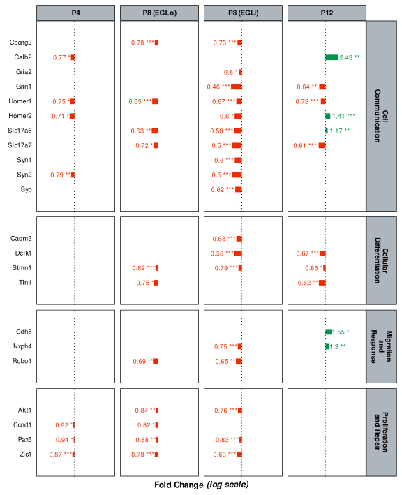
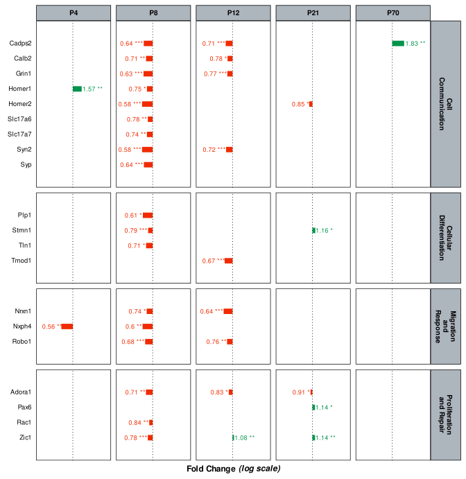
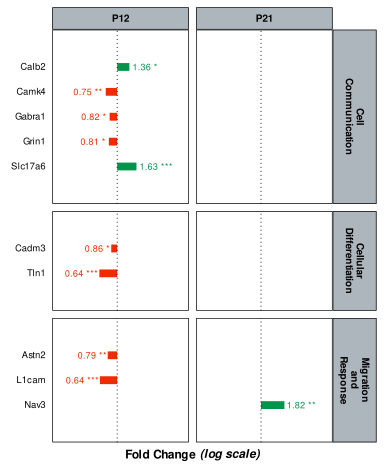
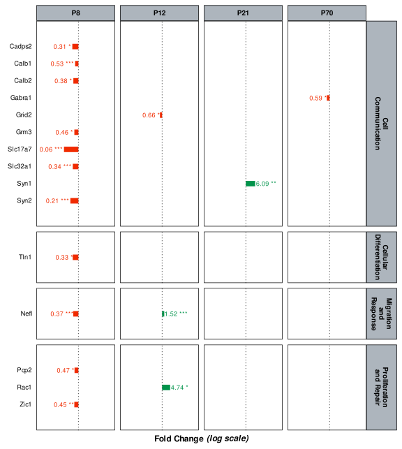
We can get a general overview of which Gene are up or down-regulated through a Sunburst plot, stacked by Stage and Layer.

make_suburst_plot
make_suburst_plot <- function(dat, layers, tooltips = NULL, colors = NULL, plot_options = list()) {
    if (!is.null(colors)) {
        colors <- set_names(colors, \(x) x |> str_replace_all(" ", "\n") |> str_replace_all("and\n", "and "))
    }

    .make_sunburst_data <- function(dat, layers_part) {
        if (all(layers == layers_part)) {
            sun_dat <- summarize(dat, across(any_of(c(layers_part, tooltips)), first), .by = all_of(layers_part))
        } else {
            sun_dat <- summarize(dat, across(any_of(layers_part), first), .by = all_of(layers_part))
        }

        return(
            bind_cols(
                transmute(sun_dat, ids = pick(any_of(layers_part)) |> pmap_chr(\(...) str_c(..., sep = ">>"))),
                transmute(
                    sun_dat,
                    parents = pick(any_of(layers_part)) |>
                        select(-last_col()) |>
                        pmap_chr(\(...) str_c(..., sep = ">>")) |>
                        bind(x, if (is_empty(x)) "" else x)
                ),
                transmute(sun_dat, labels = pick(any_of(layers_part)) |> select(last_col()) |> pull(1))
            ) |>
                bind(
                    x,
                    if (all(layers == layers_part) && !is.null(tooltips)) {
                        bind_cols(
                            x,
                            transmute(
                                sun_dat,
                                hovertext = pmap_chr(
                                    pick(all_of(tooltips)),
                                    \(...) {
                                        str_c(
                                            names(c(...)),
                                            map_if(list(...), is.numeric, \(x) round(x, 3)) |>
                                                map_if(is.factor, as.character),
                                            sep = ": ",
                                            collapse = "\n"
                                        )
                                    }
                                )
                            )
                        )
                    } else {
                        x
                    }
                ) |>
                mutate(labels = labels |> str_replace_all(" ", "\n") |> str_replace_all("and\n", "and "))
        )
    }

    params <- map_dfr(seq_along(layers), \(x) .make_sunburst_data(dat, layers[1:x])) |>
        mutate(bg_color = map_chr(labels, \(x) colors[[x]] %||% NA))

    rlang::exec(
        plotly::plot_ly,
        !!!select(params, -bg_color),
        type = "sunburst",
        branchvalues = "total",
        hoverinfo = "text",
        sort = FALSE,
        marker = list(colors = ~ params$bg_color),
        !!!plot_options
    )
}
ND_data$predictions |>
    filter(Expression != regulation_type$NOT_REG) |>
    left_join(supplementary_data$gene_data$ND, join_by(Gene)) |>
    make_suburst_plot(
        layers = c("Stage", "Layer", "Expression", "Gene"),
        tooltips = c("Gene", "Pathway", "Pathway_family", "Fold", "p.value"),
        colors = sunburst_pcr_colors,
        plot_options = list(insidetextorientation = 'radial')
    )

3.2 Regulation & Pathways

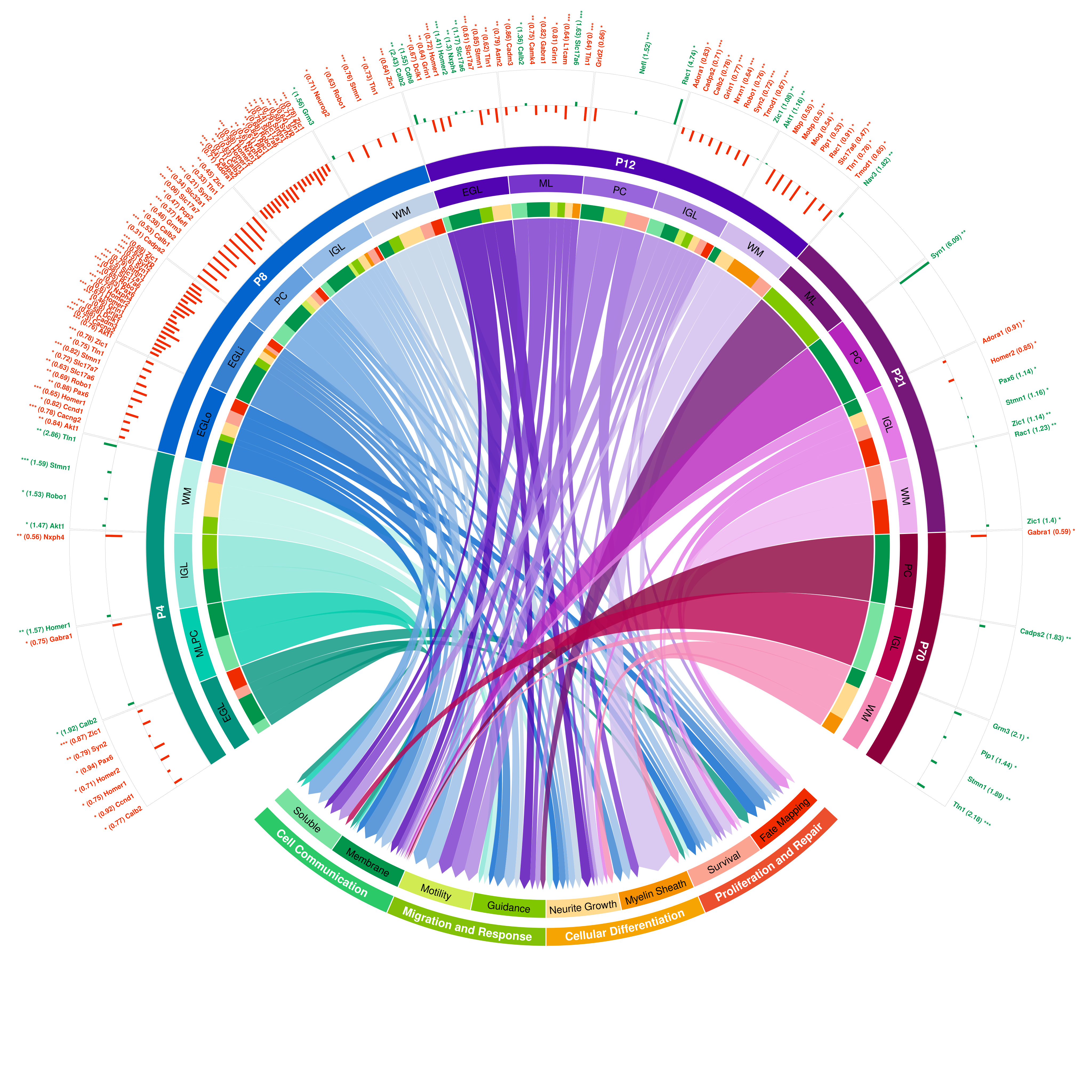
We can extend the previous plot to better visualize to which Pathway the regulated genes are linked to.

make_circlize_plot
make_circlize_plot <- function(dat, resolution = 15000, save_to = NULL) {
    stage_list <- read_excel(configs$data$PCR$data_dict, sheet = "Stage")$Name
    layer_list <- read_excel(configs$data$PCR$data_dict, sheet = "Layer")$Name |> discard(\(x) x == "Whole")
    pathway_families <- read_excel(configs$data$PCR$data_dict, sheet = "Pathway_family")$Name

    crossed_layer_order <- (crossing(Stage = stage_list, Layer = layer_list) |>
        mutate(across(c(Stage, Layer), \(x) to_factor(x, configs$data$PCR$data_dict))) |>
        arrange(Stage, Layer) |>
        unite(c(Stage, Layer), col = "Layer", sep = "_", remove = FALSE) |>
        pull(Layer))

    circlize_data <- (dat |>
        filter(p.value <= .05) |>
        select(Stage, Layer, Gene, Pathway, Pathway_family, Fold, p.value, Expression) |>
        unite(c(Stage, Layer), col = "Layer", sep = "_", remove = FALSE) |>
        mutate(Layer = factor(Layer, levels = crossed_layer_order)) |>
        arrange(Layer) |>
        droplevels())

    df_chord <- (circlize_data |>
        distinct(Layer, Pathway, Gene) |>
        summarize(N_reg = n(), .by = c(Layer, Pathway)) |>
        mutate(Layer = as.character(Layer)))

    mat_chord <- (xtabs(
        N_reg ~ Layer + Pathway,
        data = df_chord |>
            mutate(
                Layer = factor(Layer, levels = crossed_layer_order),
                Pathway = to_factor(Pathway, configs$data$PCR$data_dict)
            ) |>
            arrange(Layer),
        drop.unused.levels = TRUE
    ))

    df_layer <- (tibble(Sector = rownames(mat_chord)) |>
        mutate(N_Connection = rowSums(mat_chord)) |>
        filter(N_Connection > 0))

    df_pathway <- (tibble(Sector = colnames(mat_chord)) |>
        mutate(N_Connection = colSums(mat_chord)) |>
        filter(N_Connection > 0))

    qual_col_pals <- RColorBrewer::brewer.pal.info[RColorBrewer::brewer.pal.info$category == 'qual', ]
    col_vector <- unlist(mapply(RColorBrewer::brewer.pal, qual_col_pals$maxcolors, rownames(qual_col_pals)))

    df_extra <- (bind_rows(df_layer, df_pathway) |>
        mutate(
            Color = col_vector[1:n()],
            Layer = ifelse(str_detect(Sector, "P[0-9]+_"), str_remove(Sector, "P[0-9]+_"), NA),
            Stage = str_extract(Sector, "P[0-9]+")
        ) |>
        select(Sector, Layer, Stage, Color, N_Connection))

    get_genes_barplot <- function(index, theta) {
        return(
            circlize_data |>
                filter(Layer == index) |>
                distinct(Gene, Fold, p.value, Expression) |>
                mutate(
                    Orientation = theta,
                    Label = ifelse(
                        Orientation < 90 | Orientation > 270,
                        as.character(str_glue("{Gene} ({round(Fold, 2)}) {gtools::stars.pval(p.value)}")),
                        as.character(str_glue("{gtools::stars.pval(p.value)} ({round(Fold, 2)}) {Gene}"))
                    ),
                    Fold = ifelse(
                        Fold >= 1,
                        scales::rescale(Fold, to = c(0, 1), from = c(1, max(circlize_data$Fold))),
                        scales::rescale(Fold, to = c(-1, 0), from = c(min(circlize_data$Fold), 1))
                    ),
                    Color = ifelse(str_detect(Expression, regulation_type$UPREG), colors_fold[2], colors_fold[1])
                ) |>
                arrange(Gene) |>
                select(Fold, Label, Color)
        )
    }

    # Drawing the plot

    if (!is.null(save_to)) {
        png(save_to, width = resolution, height = resolution)
    }

    circos.clear()

    circos.par(cell.padding = c(0, 0, 0, 0), points.overflow.warning = FALSE, start.degree = 180)

    colors <- c(
        "#03937e",
        "#02ccae",
        "#86e3d5",
        "#b9f0e7",
        "#0264cc",
        "#3680cf",
        "#66a0de",
        "#95bce6",
        "#bed1e6",
        "#5204b3",
        "#7835cc",
        "#9965db",
        "#ac85de",
        "#d1bbed",
        "#76187a",
        "#b625bb",
        "#e37ae6",
        "#eeb1f0",
        "#8c013b",
        "#b8024e",
        "#f589b6",
        "#f02b00",
        "#faa491",
        "#f59002",
        "#ffda8f",
        "#81c700",
        "#d1eb52",
        "#01944b",
        "#78e3a1"
    )

    ## Chord diagram

    h0 <- resolution / 220
    h1 <- resolution / 180
    h2 <- resolution / 90

    chord_plot <- circlize::chordDiagram(
        as.matrix(mat_chord),
        grid.col = colors,
        directional = 1,
        diffHeight = mm_h(h0 * 1.1),
        target.prop.height = mm_h(h0),
        direction.type = c("diffHeight", "arrows"),
        link.arr.type = "big.arrow",
        # big.gap = 10,
        small.gap = 0.15,
        transparency = 0.20,
        annotationTrack = "grid",
        preAllocateTracks = list(
            list(
                track.height = mm_h(h1)
            ), # Track 1 (or 3 ?)
            list(
                track.height = mm_h(h2),
                track.margin = c(mm_h(h2), 0)
            ), # Track 2
            list(
                track.height = mm_h(h1)
            ) # Track 3 (or 1 ?)
        ),
        annotationTrackHeight = mm_h(h1), # Track 4
        scale = TRUE
    )

    ## Track 4 : Layer/Stage legend

    track_chord <- 4
    cex_chord <- resolution / 1350

    circos.track(
        track.index = track_chord,
        panel.fun = function(x, y) {
            theta <- (circlize(mean(CELL_META$xlim), 1.3)[1, 1] %% 360)[[1]]
            facing <- ifelse(theta > 220 && theta < 320, c("outside", "bending.outside"), c("inside", "bending.inside"))

            circos.text(
                CELL_META$xcenter,
                CELL_META$ycenter,
                str_remove(CELL_META$sector.index, "P[0-9]+_"),
                col = "black",
                font = 1,
                cex = cex_chord,
                adj = c(0.5, 0.5),
                facing = facing
            )
        },
        bg.border = NA
    )

    ## Track 3 : Stage & Pathway family legend

    track_families <- 3
    cex_families <- resolution / 1200

    colors.stages <- c("#03937e", "#0264cc", "#5204b3", "#76187a", "#8c013b")

    for (stage in stage_list) {
        highlight.sector(
            sector.index = df_extra |> filter(Stage == stage) |> pull(Sector), # purrr::keep(df_extra$Sector, \(x) str_detect(x, "P4"))
            track.index = track_families,
            col = colors.stages[which(stage_list == stage)[[1]]],
            text = stage,
            cex = cex_families,
            font = 2,
            text.col = "white",
            facing = "bending.inside",
            niceFacing = FALSE
        )
    }

    colors.pf <- c("#eb4f2d", "#83c108", "#f5a402", "#2cc969")

    for (pf in pathway_families) {
        circlize_data |> filter(Pathway_family == pf) |> distinct(Pathway) |> pull()

        highlight.sector(
            sector.index = circlize_data |> filter(Pathway_family == pf) |> distinct(Pathway) |> pull(),
            track.index = track_families,
            col = colors.pf[which(pathway_families == pf)[[1]]],
            text = pf,
            cex = cex_families,
            font = 2,
            text.col = "white",
            facing = "bending.outside",
            niceFacing = TRUE
        )
    }

    ## Track 2 : barplot

    track_barplot <- 2
    cex_barplot <- resolution / 2000

    circos.track(
        track.index = track_barplot,
        panel.fun = \(x, y) {
            if (str_detect(CELL_META$sector.index, "P[0-9]+_")) {
                circos.segments(
                    x0 = 0,
                    x1 = 1,
                    y0 = 0,
                    y1 = 0,
                    lty = "solid"
                )

                draw.sector(
                    get.cell.meta.data("cell.start.degree", sector.index = CELL_META$sector.index),
                    get.cell.meta.data("cell.end.degree", sector.index = CELL_META$sector.index),
                    rou1 = get.cell.meta.data("cell.top.radius", track.index = track_barplot),
                    rou2 = get.cell.meta.data("cell.top.radius", track.index = track_barplot + 1) + mm_h(2)
                )

                theta <- (circlize(mean(CELL_META$xlim), 1.3)[1, 1] %% 360)[[1]]
                genes_barplot <- get_genes_barplot(CELL_META$sector.index, theta)
                # xpos <- seq(from = 0.1, to = 0.9, length.out = nrow(genes_barplot))
                # xamp <- abs(CELL_META$cell.xlim[2] - CELL_META$cell.xlim[1])
                xpos <- seq(
                    from = CELL_META$cell.xlim[1] + 0.05,
                    to = CELL_META$cell.xlim[2] - 0.05,
                    length.out = nrow(genes_barplot)
                )
                facing <- ifelse(theta < 90 || theta > 270, "clockwise", "reverse.clockwise")
                adjust <- ifelse(theta < 90 || theta > 270, c(0, 0.5), c(1, 0.5))

                if (nrow(genes_barplot) > 0) {
                    circos.barplot(
                        pos = xpos,
                        value = genes_barplot$Fold,
                        bar_width = 0.025,
                        col = genes_barplot$Color,
                        border = genes_barplot$Color
                    )

                    circos.text(
                        x = xpos,
                        y = get.cell.meta.data("cell.top.radius", track.index = track_barplot) + 0.2,
                        labels = genes_barplot$Label,
                        col = genes_barplot$Color,
                        font = 2,
                        cex = cex_barplot,
                        adj = c(adjust),
                        facing = c(facing)
                    )
                }
            }
        },
        bg.border = NA
    )

    ## Track 1 : Empty (gene labels)

    if (!is.null(save_to)) dev.off()
}
ND_data$predictions |>
    left_join(supplementary_data$gene_data$ND, join_by(Gene)) |>
    make_circlize_plot()

3.3 Gene regulation timeline

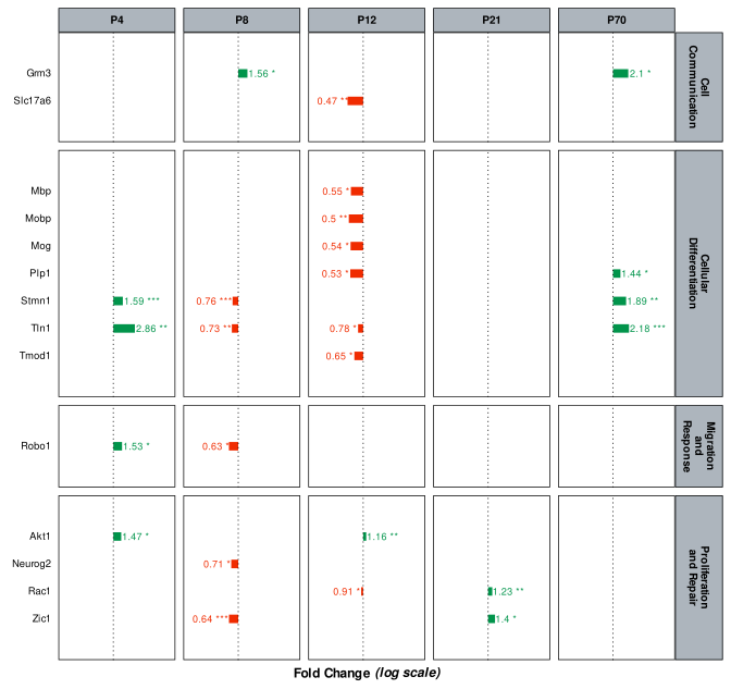
To get a better idea of how each Gene’s regulation changes through time, we can plot a timeline of their expression, split by Layer and Pathway.

make_fold_timeline_plot
make_fold_timeline_plot <- function(
    dat,
    facet_rows = "Pathway",
    trans = "identity",
    color_by = NULL,
    colors = colors_effect,
    size_boost = 1
) {
    origin <- do.call(trans, list(1))

    dat <- (dat |>
        mutate(Fold_trans = do.call(trans, list(Fold))) |>
        mutate(
            Fold_Amp = ifelse(
                max(Fold_trans, na.rm = TRUE) - min(Fold_trans, na.rm = TRUE) != 0,
                max(Fold_trans, na.rm = TRUE) - min(Fold_trans, na.rm = TRUE),
                mean(Fold_trans, na.rm = TRUE)
            ) *
                0.1,
            .by = all_of(c(facet_rows, "Stage"))
        ))

    timeline <- (ggplot(dat) +
        {
            if (is.null(color_by)) aes(x = Gene, color = Fold >= 1) else aes(x = Gene, color = .data[[color_by]])
        } +
        geom_linerange(aes(ymax = Fold_trans), ymin = origin, linewidth = 2 + (size_boost * 0.5)) +
        geom_hline(yintercept = origin, linewidth = 0.3, linetype = "dotted") +
        geom_text(
            aes(
                label = str_c(round(Fold, 2), stars.pval(p.value) |> str_replace(fixed("."), ""), sep = " "),
                y = ifelse(Fold_trans > origin, Fold_trans + Fold_Amp, Fold_trans - Fold_Amp),
                hjust = ifelse(Fold > 1, 0, 1)
            ),
            vjust = 0.5,
            angle = 0,
            size = 2 + (size_boost * 0.25),
            check_overlap = TRUE
        ) +
        scale_color_manual(" ", values = colors) +
        scale_y_continuous(breaks = c(0, 1, 2, 3), expand = expansion(mult = 1.01 * (1 + (size_boost / 100)))) +
        scale_x_discrete(expand = expansion(add = 1 * size_boost), limits = \(x) rev(x)) +
        labs(
            x = "",
            y = ifelse(trans != "identity", str_glue("Fold Change *({trans} scale)*"), "Fold Change")
        ) +
        coord_flip() +
        facet_grid(
            vars(.data[[facet_rows]]),
            vars(Stage),
            scales = "free_y",
            space = "free_y",
            labeller = label_wrap_gen(width = 12, multi_line = TRUE)
        ) +
        {
            if (!is.null(color_by)) guides(color = guide_legend(title = color_by))
        } +
        theme(
            legend.position = ifelse(is.null(color_by), "none", "bottom"),
            axis.text.x = element_blank(),
            axis.title.x = element_markdown(size = 9),
            axis.text.y = element_text(size = 7),
            strip.text = element_text(size = 5 * size_boost),
            plot.title = element_markdown(size = 9, face = "plain", vjust = 1, hjust = 0.5)
        ))

    return(timeline)
}
render_ND_timeline
render_ND_timeline <- function(dat, group) {
    cur_group_name <- get_var_level_name("Layer", first(group[[1]]), "PCR")

    plot <- make_fold_timeline_plot(
        dat,
        facet_rows = "Pathway_family",
        trans = "log",
        colors = colors_fold,
        size_boost = 1.5
    )

    width <- 2 + n_distinct(dat$Stage)
    height <- dat |>
        group_by(Pathway_family) |>
        group_map(\(d, g) n_distinct(d$Gene) * 0.1 + 1.3) |>
        flatten_dbl() |>
        sum()

    template_md <- c(
        '### `r cur_group_name`',
        '```{r}',
        '#| echo: false',
        '#| fig-width: !expr width',
        '#| fig-height: !expr height',
        'plot',
        '```'
    )

    knitr::knit_child(text = template_md, envir = rlang::env(), quiet = TRUE)
}
ND_timelines <- (ND_data$predictions |>
    left_join(supplementary_data$gene_data$ND, join_by(Gene)) |>
    left_join(supplementary_data$layer_families, join_by(Layer)) |>
    filter(p.value <= .05) |>
    filter(!(Layer_family == "PC" & Stage == "P4")) |> # PCs are too small and undifferentiated at that stage to properly microdissect
    select(
        Stage,
        Layer,
        Layer_family,
        Gene,
        Fold,
        p.value,
        Expression,
        Pathway,
        Pathway_family
    ) |>
    mutate(
        Stage = case_when(
            Layer %in% c("EGLi", "EGLo") ~ str_glue("{Stage} ({Layer})"),
            .default = as.character(Stage)
        ) |>
            factor(
                levels = c("P4", "P8", "P8 (EGLo)", "P8 (EGLi)", "P12", "P21", "P70")
            )
    ) |>
    group_by(Layer_family) |>
    group_map(render_ND_timeline) |>
    unlist())
Back to top